Context & challenge
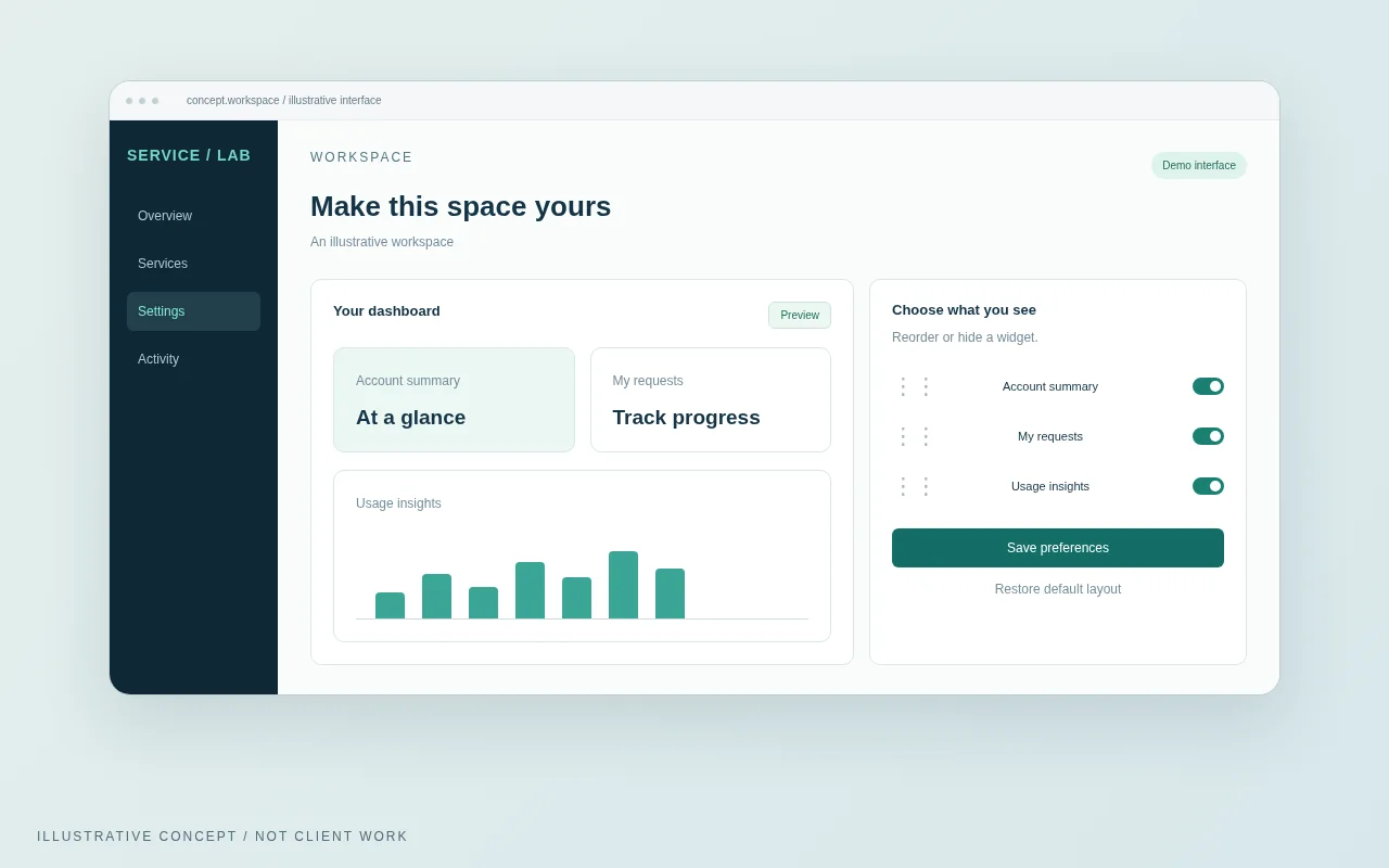
Imagine an account dashboard serving people with different priorities. This concept explores optional personalization while keeping the default experience useful and easy to recover.
Role & collaboration
A real version of this case study should distinguish decisions I owned, work I reviewed and contributions made by the team. For this example, the proposed scope spans UX direction, UI review and front-end collaboration.
Evidence to collect
- Customer or operator interviews: record the problem in their own words.
- Journey or task review: identify the moments that cause uncertainty.
- Technical and service constraints: document what the design cannot change.
Decisions & trade-offs
Keep a useful default
Make editing optional; include a reset action. Trade-off: less freedom than an empty canvas, but a more dependable starting point.
Use explicit reorder controls
Provide move-up and move-down actions alongside drag and drop. The experience should not depend on precise pointer movement.
Design direction
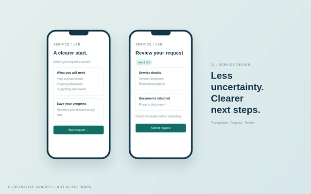
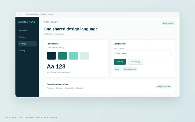
Giving people useful control without turning the home screen into another task. The visual is an illustrative interface, not a screenshot of an NWC system.
Starting point / hypothetical
Every user sees the same arrangement of information.
Proposed direction / concept
A useful default with optional reordering and reset.
Validation & outcomes
No outcome is claimed for this sample. Replace this section with a baseline, comparison period and verified results before publishing it as real work.
Reflection
In a real study, end with the decision that changed after testing, what the team learned and what still needs work. Do not present the concept as a validated result.
Back to all work